EcoSTEM: one company, three audiences, three websites
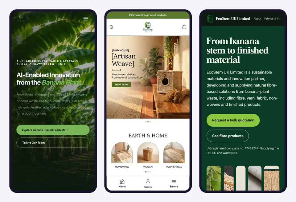
A sustainable-materials company needed to speak to European importers, CSR partners, UK manufacturers and home-décor shoppers. I worked on its three public websites so each one answers a different question, while the brand and the facts stay the same.
- Client
- EcoSTEM Group, Bhilai, India, with entities in Estonia and the UK
- Role
- Designer and developer, working solo as DeLevi Design
- Deliverables
- Corporate website, online store, UK supplier website, four social channels
- Markets
- India, the EU and the UK
- Built with
- Hand-coded HTML, CSS and JavaScript for the group site. A hosted store platform for the shop.
- Status
- All three sites live
Summary
EcoSTEM turns banana-plant waste into fibre, yarn, fabric, vegan leather, extracts and nutrients. It runs as three legal entities: an Indian manufacturer, a non-profit foundation that maps farms and trains women, and an EU-registered company that handles European compliance.
One website could not serve everyone who needs to reach it. A procurement manager in Europe, a company looking for a CSR partner, a university department and a shopper buying a basket all arrive with different questions. I gave each audience its own site and made the claims behind all three easy to check.
The challenge
EcoSTEM is a young company with a large claim: a circular economy built on an agricultural by-product, reaching global markets. Three things made the website job harder than a normal company site.
- Many audiences, one story. Manufacturers in textiles, fashion, agrochemicals and packaging. European importers. CSR partners. Farmers and cooperatives. Universities. Government agencies. Shoppers. Each wants a different first screen.
- Sustainability claims invite doubt. "Deforestation-free" and "women-led" are easy to say. A buyer who has to sign a due diligence statement wants to see what is actually in place.
- Three entities confuse people. Visitors ask who they would be contracting with, who runs the farms, and who ships to Europe.
Approach
I started from the visitor's question instead of the organisation chart, and gave each question a home.
| Site | Who it is for | The question it answers | Main action |
|---|---|---|---|
| ecostemgroup.com | B2B buyers, EU importers, CSR partners, farmers, universities, government | Who is EcoSTEM, can I trust it, and how do I work with it? | Send the right enquiry |
| ecostemmaterials.com | Shoppers in India | What can I buy for my home? | Add to bag |
| ecostem.uk | Manufacturers in the UK and EU | What exactly do you supply, in what grades and specifications? | Request a bulk quotation |
Three rules held across all three sites: give each visitor one clear next step, show the specifics instead of adjectives, and show the real status of every claim.
The group site
The group site is the company's front door. It explains the whole organisation to a mixed audience and sends each visitor to the right place. It is hand-coded in HTML, CSS and JavaScript, with a small PHP script that handles the forms.
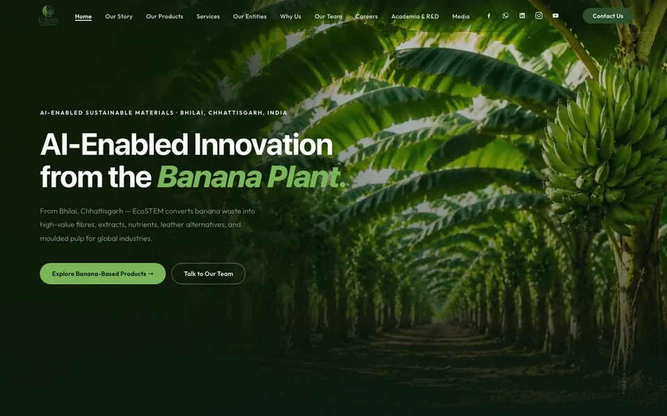
Separate the enquiries by who is asking
Instead of one contact form, the site has five, and each asks only what that visitor can answer.
- Product enquiry. Company, email and the product of interest: vegan leather, bio-composite panels, natural fibre textiles or custom R&D.
- EU and export. Country, and what the buyer needs: a due diligence statement, product sourcing or a distribution partnership.
- CSR partnership. Organisation and a budget range, so the team knows the scale of the conversation.
- Careers. Role of interest, city and a CV link.
- Academia. Institution, discipline and the type of collaboration: an internship, joint research, a pilot line, a guest lecture or a grant proposal.
The aim is that the sales team reads an enquiry that already says what the visitor wants, and the visitor does not have to explain themselves in an empty message box. Each message arrives with the name of the form in its subject line (for example "EcoSTEM Website - CSR Partnership Enquiry"), so the team can sort the inbox at a glance.
Explain three entities in three cards
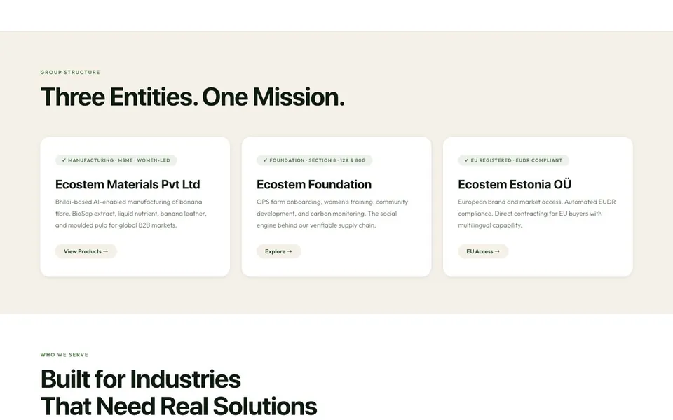
Each card gives the entity's role in one line: manufacturing, the foundation, and the EU legal entity for European buyers. Together they answer "who am I dealing with" before the visitor has to ask.
Show the status of every claim
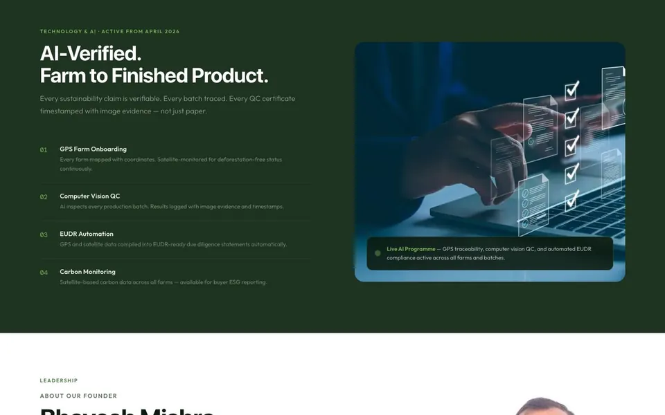
A dedicated section lists each registration and certification with a status next to it. Section 8 non-profit status, 12A and 80G, EUDR compliance through the Estonian entity, women-led enterprise recognition and GPS traceability are marked Active. ISO, GOTS and OEKO-TEX are marked In progress, with a line saying applications are under way.
I think that is the strongest design decision on the site. A buyer who finds one claim overstated will doubt all of them, and one who sees an honest "in progress" trusts the rest.
Use real people and real places
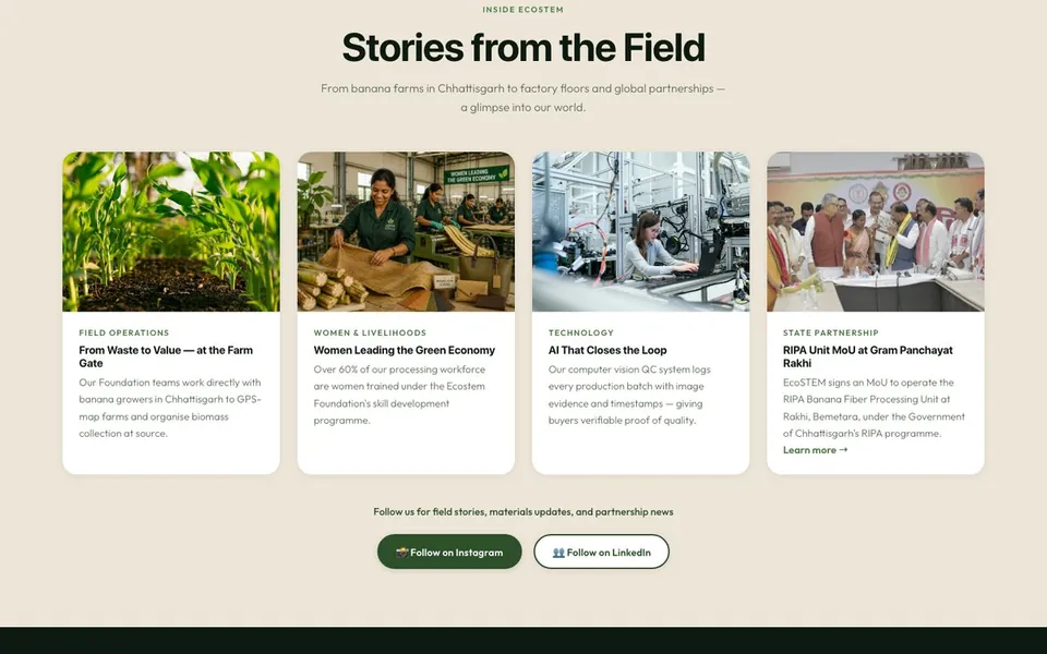
The founder, the leadership team, the community programmes and press coverage all appear with their own photographs. For a company whose claim is that it is rooted in rural India, the pictures are part of the evidence.
Build it to load and read well
- All 63 images have descriptive alt text, and 61 load lazily.
- Two typefaces only, a sans for reading and a monospace for labels.
- A collapsing menu and layouts that work on a phone.
The online store
The store sells handcrafted home décor and accessories made from banana fibre to shoppers in India. It runs on a hosted store platform, so the cart, checkout and order management come with the platform. The design work is in the brand, the catalogue structure and the merchandising.
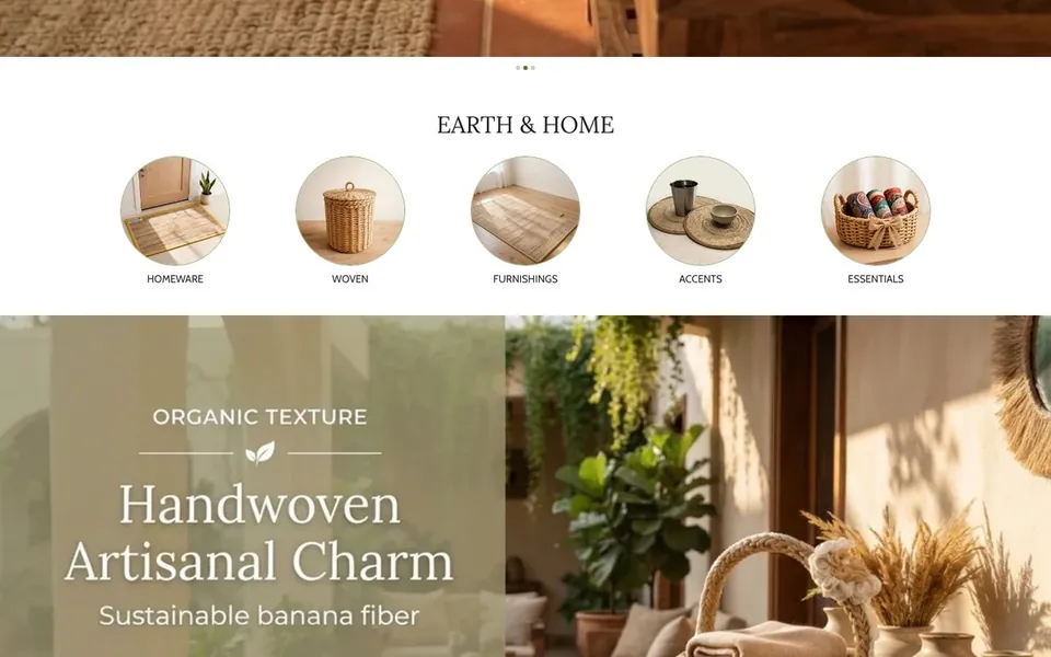
- Browse by use. Shoppers choose Homeware, Woven, Furnishings, Accents or Essentials, and can also browse by style or by "Natural Living". Banana fibre is the story, not the filter.
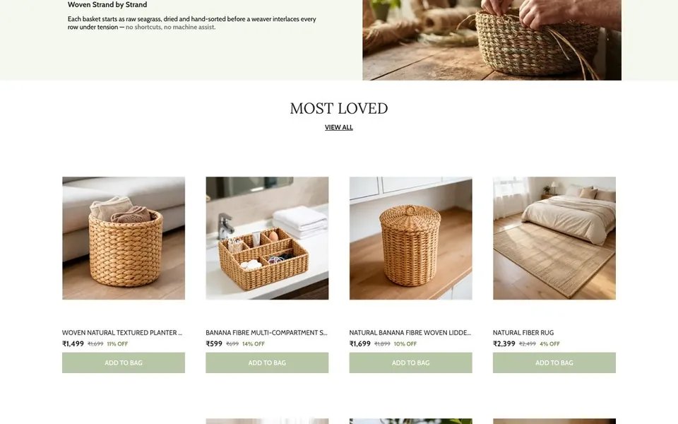
- Photography does the selling. Products are shown in warm room settings, with a clear product grid for comparison under "Just landed" and "Most loved".
- Social proof and policies in view. Customer reviews sit on the home page. Return, shipping, terms and privacy policies are linked from the footer, with the accepted payment methods.
- Same brand as the group site. The same logo and green, in a light, friendly layout.
The UK supplier site
EcoStem UK Limited sells to manufacturers, so this site works like a specification sheet with a quotation form attached. The visitor is an expert who needs numbers.
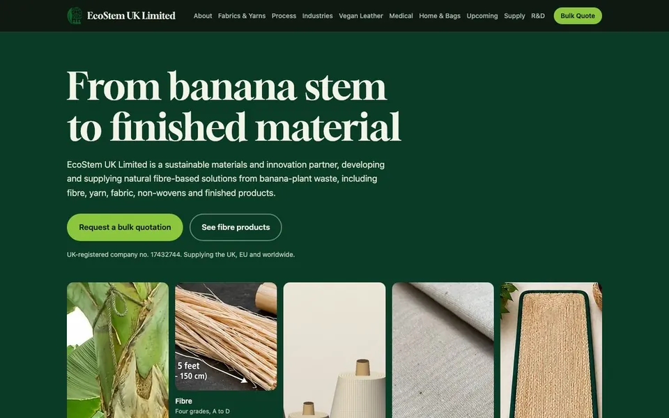
- One action, repeated. "Request a bulk quotation" is in the first screen and in the menu, and the page closes on the form.
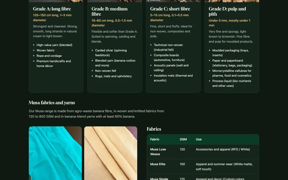
- Specifications instead of adjectives. Four fibre grades, A to D, each with length, diameter and uses. Fabrics from 120 to 800 GSM in a table, with the intended use of each. Yarn blends that contain at least 60% banana.
- Industries as the way in. A section for each buyer type: fashion, home furnishing, automotive and furniture, medical and hygiene, packaging, and construction and acoustics.
- A serif display face. It gives a company that is new to the UK a more established tone than the group site's technical look.
- Structured data. Organisation and website markup, so search engines understand who the company is.
Honest status here too
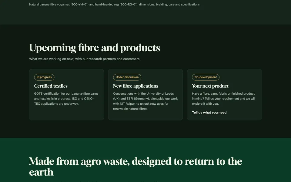
The same principle as the group site. GOTS certification is described as in progress, research conversations are described as conversations, and an open invitation to co-develop is labelled as one. Nothing is presented as finished before it is.
One brand, three voices
The three sites share a logo, a green and a set of facts. Everything else is tuned to the visitor.
| Aspect | Group site | Online store | UK site |
|---|---|---|---|
| Mood | Dark, editorial, confident | Light, warm, friendly | Deep green, technical, established |
| Type | Sans-serif with a monospace for labels | Clean sans-serif | Serif headlines with a sans for reading |
| Imagery | Fields, people and press | Products in rooms | Fibre, yarn and fabric close up |
| Content | Story and proof | Products and reviews | Grades, GSM and use cases |
Outcome
- Three live websites, each with a single clear job, and a shared identity across them.
- Five enquiry forms that sort leads by who is asking.
- A claims section with honest statuses, which supports the company's central message of verifiable sustainability.
- Four social channels set up: Instagram, LinkedIn, WhatsApp Business and YouTube.
"DeLevi Design built our website exactly the way our story needed to be told — sustainable materials, AI-enabled traceability, EUDR compliance, all of it communicated clearly to buyers across India and Europe. Professional from the first call to launch."
 Bhavesh MishraFounder & CEO, EcoSTEM Group
What I would do next
- Connect the three sites. The group site does not yet link to the store or the UK site, and the UK site links back only to the group site. A shared way to move between them would help a visitor who started in the wrong place.
- Measure the five forms. Count which enquiries arrive and which convert, then simplify or merge the ones that do not.
- Add case studies for buyers. Show a finished product made from EcoSTEM fibre, from sample to shipment, once a customer agrees to be named.
Have more than one audience?
Tell us who needs to reach you and what each of them needs to see.